
Introduction
Box plots (a.k.a. whisker plots) are a biostatistician’s best friend when comparing distributions across treatments, species, or conditions. They summarize the spread and central tendency of your data with a compact visual built from the five-number summary: minimum, first quartile (Q1), median, third quartile (Q3), and maximum. In biological research—think plant growth under fertilizers, enzyme activity across pH levels, or body measurements across populations—box plots give you an immediate sense of variability, outliers, and differences between groups.
In this tutorial, you’ll build a publication-ready box plot in R using a small biological dataset of plant height measured under three treatments: Control, Fertilizer A, and Fertilizer B. We’ll use ggplot2 for clean aesthetics and flexible customization. You’ll get:
- A fully annotated R script you can run as-is.
- A step-by-step explanation of each line.
- Biological interpretation tips.
- Optional enhancements (tall figure size, jittered points, and more).
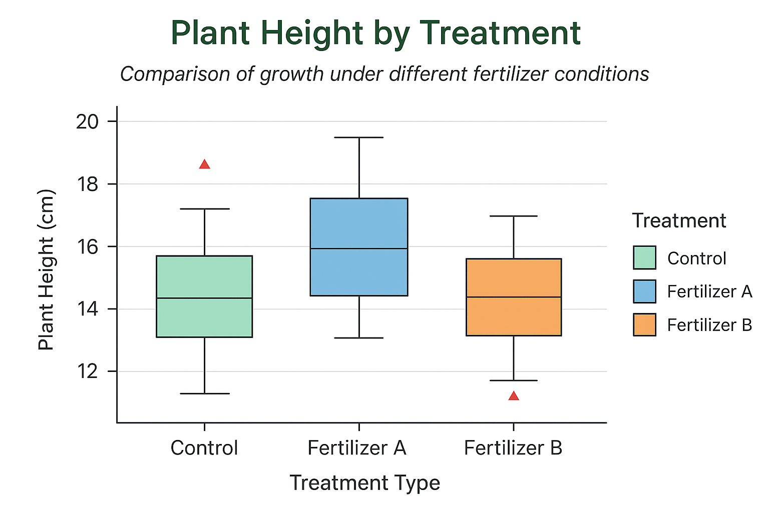
The Biological Dataset
We’ll work with a compact dataset representing plant height (cm) under three fertilizer regimes. This style of dataset is common in biology labs and controlled experiments.
| Treatment | Height_cm (n=5 each) |
|---|---|
| Control | 14.2, 13.8, 15.1, 14.8, 13.5 |
| Fertilizer A | 16.5, 17.2, 15.9, 16.8, 17.5 |
| Fertilizer B | 18.4, 19.1, 18.8, 19.6, 18.9 |
In the script, these values are organized into a tidy data.frame with two columns: Treatment (categorical) and Height_cm (numeric). This format is ideal for ggplot2.
Step-by-Step: Building the Box Plot in R
1) Install and load ggplot2
install.packages("ggplot2")
library(ggplot2)
install.packages("ggplot2") ensures the package is available (run once per machine).
library(ggplot2) makes its functions available in your session.
These are the very first lines in your script, guaranteeing a consistent environment.
2) Create the biological dataset
plant_data <- data.frame(
  Treatment = rep(c("Control", "Fertilizer A", "Fertilizer B"), each = 5),
  Height_cm = c(
    14.2, 13.8, 15.1, 14.8, 13.5,    # Control
    16.5, 17.2, 15.9, 16.8, 17.5,    # Fertilizer A
    18.4, 19.1, 18.8, 19.6, 18.9     # Fertilizer B
  )
)
What’s happening here:
rep(c("Control", "Fertilizer A", "Fertilizer B"), each = 5)repeats each treatment label five times, matching the five measurements per group.- Heights are provided in the same order, so each set of five values belongs to its treatment.
- The result is a long dataset (one row per observation), exactly what ggplot2 wants.
Tip (optional): If you want a specific order on the x-axis—e.g., Control, Fertilizer A, Fertilizer B—convert Treatment to a factor with levels in your preferred order:
plant_data$Treatment <- factor(plant_data$Treatment,
                               levels = c("Control", "Fertilizer A", "Fertilizer B"))
3) Initialize ggplot and map aesthetics
ggplot(plant_data, aes(x = Treatment, y = Height_cm, fill = Treatment)) +
ggplot(plant_data, ...) starts the plot using plant_data.
aes(...) maps variables to visual properties:
x = Treatmentputs groups along the x-axis.y = Height_cmis the numeric response on the y-axis.fill = Treatmentgives each group its own fill color and auto-generates a legend.
These mappings are the backbone of your visualization.
4) Draw the box plots and style outliers
geom_boxplot(outlier.colour = "red", outlier.shape = 17, outlier.size = 3) +
geom_boxplot()draws the box (IQR), median line, whiskers, and flags outliers.outlier.colour = "red"paints outliers red.outlier.shape = 17uses triangles for outliers (shape 17).outlier.size = 3makes them clearly visible.
This is a clean, journal-friendly way to highlight extreme observations.
Note: You didn’t use notch = TRUE here—so you won’t see the “notches outside hinges” warning some users encounter. If you decide to add notches later, that warning is harmless; it just means the median’s CI extends beyond the IQR due to sample size or variability.
5) Add informative titles and axis labels
labs(
  title = "Plant Height by Treatment",
  subtitle = "Comparison of growth under different fertilizer conditions",
  x = "Treatment Type",
  y = "Plant Height (cm)",
  fill = "Treatment"
) +
titleandsubtitlegive immediate context (what and why).xandylabel axes with units (critical for scientific reporting).fillsets the legend title (because fill is mapped to Treatment).
These labels make your plot self-explanatory in papers, slides, or posters.
6) Apply manual colors for consistency
scale_fill_manual(values = c(
  "Control" = "lightgreen",
  "Fertilizer A" = "skyblue",
  "Fertilizer B" = "orange"
)) +
- This overrides ggplot2’s default palette.
- The names in the vector must match the levels of
Treatment. - Manual colors ensure visual consistency across figures in a thesis or article.
7) Choose a clean theme and tune typography
theme_minimal(base_size = 14) +
theme_minimal()removes chartjunk and keeps the figure crisp.base_size = 14increases the default font size—great for readability on screens and print.
8) Fine-tune titles, axes, and legend
theme(
  plot.title = element_text(face = "bold", color = "darkgreen"),
  plot.subtitle = element_text(face = "italic"),
  axis.title.x = element_text(face = "bold"),
  axis.title.y = element_text(face = "bold"),
  legend.position = "right"
)
Boldface on the title/axis titles improves hierarchy and scannability.
A subtle color on the title (dark green) echoes the biological theme.
legend.position = "right" keeps labels compact; “top” is also a nice option if space is tight.
These choices give you a publication-ready look without heavy tweaking.
Interpreting the Box Plot (Biological Context)
Once you render the plot, read it like a biologist:
- Median (thick line inside the box): The central tendency of plant height for each treatment. Compare medians to see which fertilizer tends to produce taller plants.
- IQR (the box): Middle 50% of observations. A taller box indicates higher variability in heights.
- Whiskers: They extend to the most extreme data points that are not outliers (typically ≤ 1.5 × IQR from the quartiles).
- Outliers (red triangles): Individual plants whose heights are unusually low or high relative to the group—possible biological variability, measurement error, or interesting outlier cases worth investigating.
- Between-group comparisons: Look for separation in medians, degree of overlap, and differences in spread. For example, if Fertilizer B has a notably higher median and a relatively tight IQR, it may be more consistently effective than Control.
If this were an experiment, you might follow up with inferential statistics (e.g., ANOVA or non-parametric tests) depending on assumptions like normality and homogeneity of variances.
Optional Enhancements (Nice-to-Have for Publications)
A) Make a tall (high-length) figure for posters/journals
If you need a vertically tall plot:
ggsave("Plant_Height_Tall_BoxPlot.png", width = 6, height = 12, dpi = 300)
Larger height than width gives you a vertical figure that fits poster columns and journal layouts.
dpi = 300 ensures print quality.
B) Overlay raw data points (common in biology)
ggplot(plant_data, aes(Treatment, Height_cm, fill = Treatment)) +
  geom_boxplot(width = 0.6, outlier.colour = "red", outlier.shape = 17, outlier.size = 3) +
  geom_jitter(aes(color = Treatment), width = 0.12, alpha = 0.7)
Shows the exact distribution of observations alongside the summary.
Adjust width in geom_jitter() to control horizontal spread.
C) Show group means explicitly
+ stat_summary(fun = "mean", geom = "point", shape = 23, size = 3, fill = "white")
Adds a white-filled diamond (shape 23) at each group mean.
D) Reorder treatments by median height
library(forcats)
plant_data$Treatment <- forcats::fct_reorder(plant_data$Treatment, plant_data$Height_cm, median)
Useful when you want the x-axis sorted by central tendency rather than arbitrary labels.
E) Horizontal layout for long treatment names
+ coord_flip()
Rotates the plot; helpful when treatments have long names or many levels.
Full R Script (as in your file)
Below is the exact code from your upload—ready to paste and run in RStudio.
# Install ggplot2 if not already installed
install.packages("ggplot2")
library(ggplot2)

# -----------------------------
# Step 1: Create biological dataset
# -----------------------------
plant_data <- data.frame(
  Treatment = rep(c("Control", "Fertilizer A", "Fertilizer B"), each = 5),
  Height_cm = c(
    14.2, 13.8, 15.1, 14.8, 13.5,    # Control
    16.5, 17.2, 15.9, 16.8, 17.5,    # Fertilizer A
    18.4, 19.1, 18.8, 19.6, 18.9     # Fertilizer B
  )
)

# -----------------------------
# Step 2: Create and customize box plot
# -----------------------------
ggplot(plant_data, aes(x = Treatment, y = Height_cm, fill = Treatment)) +
  geom_boxplot(outlier.colour = "red", outlier.shape = 17, outlier.size = 3) +
  labs(
    title = "Plant Height by Treatment",
    subtitle = "Comparison of growth under different fertilizer conditions",
    x = "Treatment Type",
    y = "Plant Height (cm)",
    fill = "Treatment"
  ) +
  scale_fill_manual(values = c("Control" = "lightgreen", "Fertilizer A" = "skyblue", "Fertilizer B" = "orange")) +
  theme_minimal(base_size = 14) +
  theme(
    plot.title = element_text(face = "bold", color = "darkgreen"),
    plot.subtitle = element_text(face = "italic"),
    axis.title.x = element_text(face = "bold"),
    axis.title.y = element_text(face = "bold"),
    legend.position = "right"
  )
Where each piece comes from in the script:
- Installation and library load at the top (ensures
ggplot2is available). plant_datacreation with three treatments × five measurements each (tidy format).ggplot(..., aes(...))mappingTreatmentto x,Height_cmto y, andfillto Treatment.geom_boxplot(...)with red triangular outliers sized at 3.labs(...)for title, subtitle, axes, and legend label.scale_fill_manual(...)to lock consistent colors per treatment.theme_minimal(base_size = 14)and a tailoredtheme(...)for publication-ready typography and layout.
Troubleshooting & Tips
- Outliers not visible? Ensure outlier settings aren’t obscured by overlapping points. You can reduce
outlier.sizeor add jittered raw points with slight transparency to separate layers visually. - Factor order looks odd? Convert
Treatmentto a factor and set your preferredlevelsso groups appear in a sensible order. - Legend placement: If the legend overlaps the plot in small figures, try
legend.position = "top"or move it inside withlegend.position = c(0.85, 0.8)(and adjusttheme(legend.background = element_rect(fill = "white"))if needed). - Fonts for journals: Consider
theme_classic()ortheme_bw()if your target journal prefers minimalist black-and-white styles. You can still keepscale_fill_manual(...)if color is allowed for the online version. - Tall figure for posters: Use
ggsave()withheightgreater thanwidthto create a high-length figure tailored to your layout.
Conclusion
With fewer than 30 lines of code, you produced a clear, publication-ready box plot that communicates distribution, central tendency, variability, and outliers across treatments. The biological dataset—plant height under Control, Fertilizer A, and Fertilizer B—is simple yet representative of many lab and field scenarios. The script uses clean aesthetics, consistent colors, and readable typography, making it suitable for manuscripts, theses, and talks.
From here, you can enhance the figure by reordering groups, overlaying raw data points, and exporting a tall figure for posters or journal layouts. Most importantly, the workflow you learned is reusable: just replace plant_data with your own tidy dataset and keep the same plotting template.
If you’d like, I can also generate a horizontal version (with coord_flip()), a black-and-white journal style, or a ready-to-paste R Markdown chunk to integrate directly into your reproducible reports.
Leave a Reply